BLOG
INTERESTING STUFF
THAT CAUGHT OUR EYE
A Tea Party at the World’s Most Expensive Home

It’s typical that we never visit the landmarks that are right on our doorstep. Recently, I attended a garden party at Buckingham Palace which gave me the rare opportunity to wear a tailcoat and – as a domestic architect – get a closer look at a truly monstrous home.
It was undeniably a great privilege to be able to have tea at Buckingham Palace, and the experience was as pleasant, grand and surreal as you would imagine. But, as always, what really struck me was the architecture and unfortunately I’m going to do something terribly bad form: insult the home of my host.
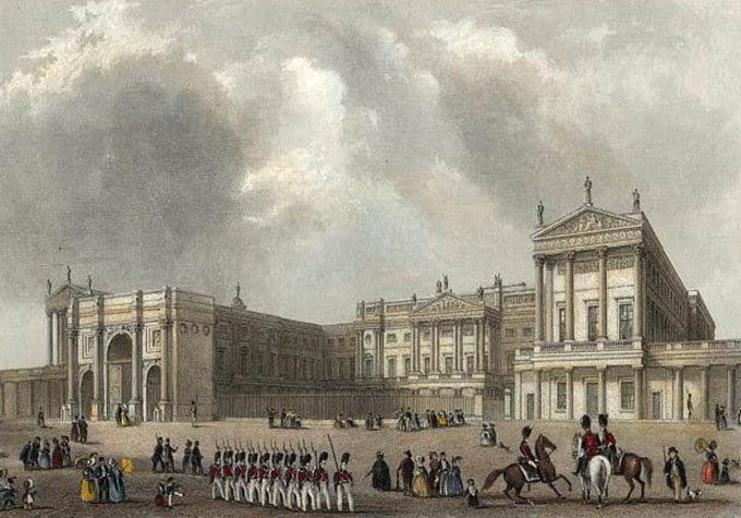
When you think of Buckingham Palace, you picture the public facing East Wing. This iconic façade is actually the newest wing of the palace in a very different style from the rest of the structure, the latest addition in centuries of drastic remodelling and expansion to satisfy extravagant royal tastes.
Edward Blore built the East Wing in 1847 to form a quadrangle and provide more space for Queen Victoria and Prince Albert. The façade was remodelled by Aston Webb in 1913 and has remained relatively unchanged since. The picture below gives a sense of how the palace looked prior to Blore’s addition.

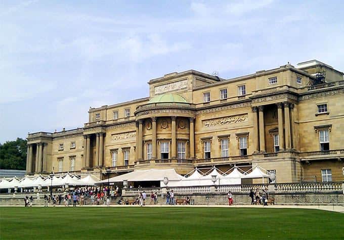
What you don’t realise from the front of the palace is that the complete structure is actually quite a mess. The front facade may not be particularly inspiring but it does feel very deliberate with its resolutely rectangular form and perfect symmetry. But it looks nothing like the older wings hidden behind it, which in turn look nothing like the garden facing façade of the West Wing.
It’s this section that I got to see for the first time during the garden party and I could have easily been convinced I was at an entirely different palace. The stoic uniformity of the front is nowhere to be seen, instead it’s an irregular stack of blocks and a facade with little consistency in shape or scale. Materially it’s not a match either; its yellow stone cladding is found nowhere else in the palace.

Reading into the history of the palace, I found that this odd section was built for George IV by John Nash in 1826 to double the size of the main block, a project for which he was fired before completion for running far over budget. The works cost almost £500,000, which in today’s money must be an unthinkably large sum.
It reminds me of the challenges we face at DGA, though obviously at an enormously exaggerated scale. I’ve had to renovate period houses that have been subject to the whims of multiple architects and owners across the generations. I’m sure each of the architects who worked on the palace felt they were making suitable additions but to me it’s a colossal example of too many cooks spoiling the broth.
Fortunately, I’ll never be tasked with renovating a royal palace, so my critiques will remain safely untested. I do, however, love bringing the best out of more modest homes, so feel free to get in touch if you want to be happier with your renovation than George IV was.
By John Dyer-Grimes
