BLOG
INTERESTING STUFF
THAT CAUGHT OUR EYE
Emperor’s Gate Won a Best of Houzz 2017 Design Award – Let’s Take a Tour

As an architect, you never know which of your projects is going to capture the public’s imagination. To us, every home we create is special, but every now and again, we get the privilege of creating one that gains a second life in wider recognition.
Emperor’s Gate has become one such project, and after winning at the British Home Awards and Design Et Al Awards, it has gained another stamp of approval – this time from Houzz, the leading online design community.
What makes this award special is that it is entirely democratic. Houzz simply sifts through their data and awards the projects that were most popular with their tens-of-millions-strong community of homeowners, design enthusiasts and professionals.
I want to use this opportunity not to celebrate the win (we’ll do that with champagne at the studio) but to celebrate Emperor’s Gate itself. So, let’s take a tour through this magnificent South Kensington Home.
The Basement

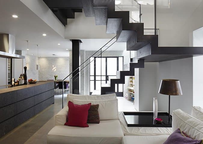
Once a warren of dark, tiny rooms, it was the basement floor that benefitted most from the renovation. We transformed it into a bright and open kitchen and living space, with light wells to the side and Crittal doors that open directly into the rear courtyard. You can’t see them in this photo, but the kitchen island has visible fossils embedded in the beautiful, polished, charcoal grey stone.
When creating open plan spaces, we must often remove key structural walls holding up the floors above. If you look just behind the staircase, you can see a supporting steel pillar; an elegant replacement to supporting walls which, by carefully matching materials, looks like it belongs to the structure.
The Ground Floor

The ground floor was once the entire home of our clients Andrew and Frederike. They wanted more space, but instead of moving from the home they loved so much, they bought the properties above and below. Suddenly, the canvas on which they could picture their dream home had tripled in size. Our challenge was to find a way to unite the three homes and make them feel like they were always a whole.
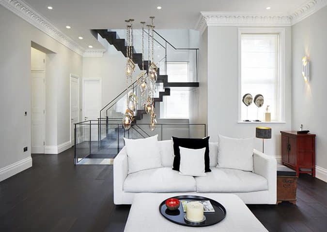
It was the staircase that solved this problem. Stretching uninterrupted from the basement to the first floor, this bespoke sculptural staircase manufactured by artisans in the Netherlands is a piece of art in and of itself.
The Living Room

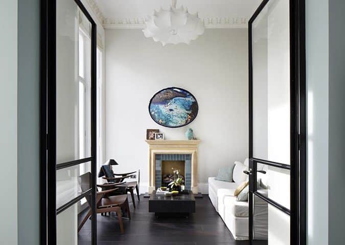
Before the renovation, this living room was Andrew and Frederike’s favourite space, and with its 3.5m high ceilings, enormous sash windows and decorative plasterwork, it’s easy to see why. With minimal structural changes required here, it was up to our interior design team to make sure the living room continued to stand out post-renovation.
The Master Bedroom

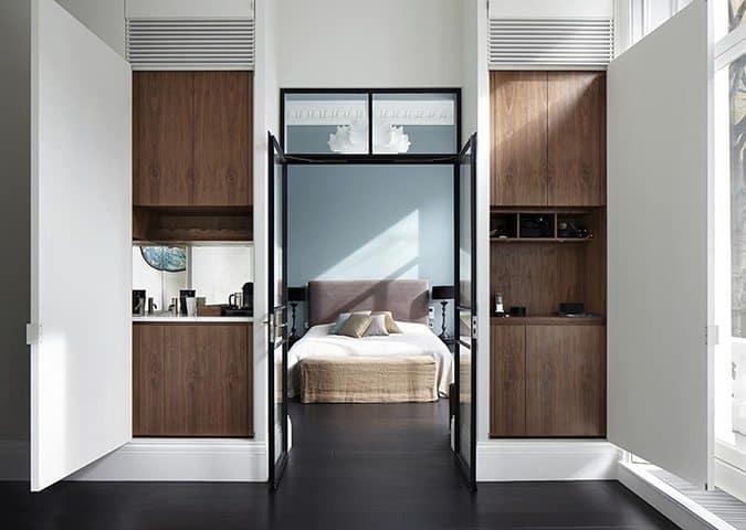
Taking up most of the first floor, this master bedroom features an en-suite bathroom, dressing room and balcony overlooking the leafy gardens below. The same chandelier as the one found in the living room fills out the generous ceiling height with a design that is contemporary in style while having a traditional silhouette, creating a perfect bridge between the new and old features in the home.
Storage is perhaps the greatest challenge of designing a family home that functions as good as it looks. The white panels in the picture above can close to hide the cupboards within, keeping clutter out of sight and (almost) out of mind.
The Nursery

Amongst all the grand spaces that we carved out in Emperor’s Gate, it was its smallest room that received the most attention over at Houzz. We don’t know whether it was the cot with its detailing that evokes period plasterwork or the Vivienne Westwood wallpaper that had people clicking, but either way our interior design team deserve special credit for creating a nursery that puts a childlike spin on the contemporary/period fusion.
We thoroughly recommend the website Houzz.com. It’s a fantastic resource for browsing and collecting design ideas for your home, and it’s been used in many design meetings here at DGA.
John Dyer-Grimes
