Earl’s Court Mews House

image

Earl’s Court Mews House

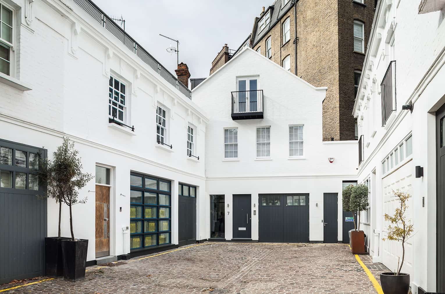
Our clients – a renowned English legal professional and an Italian artist – had purchased a run-down mews house with an ugly 1970s refurbishment that sat awkwardly at the end of an otherwise very attractive Victorian mews featuring a listed arch at the entrance.

Their objective was to entirely strip out the interior and all of its outdated design, completely rearrange the layout of the floors, add a basement extension and redecorate the façade to make it more fitting to its surroundings.

With their three children off to uni, they wanted this new space to be a pristine, almost gallery-like showcase of unique and bespoke interior design features with a very strong Italian influence. To achieve harmony between all elements, we were hired for both architectural and interior design.

You might think that making such a substantial improvement to the site would have been welcomed, but instead this proved to be one of our most contentious planning battles yet due to some fierce and organised neighbour objections.

Luckily, we managed to successfully fight for a highly ambitious project that straddled the line between new build and renovation, with every floor removed and rebuilt, a full plan basement dug out and the façade rebuilt at a higher quality while maintaining the original shape.

After planning, the biggest challenge was site logistics. Restrictions on how we could bring materials onto the site and remove waste meant relying on a tiny lorry and lots of manual labour to keep things moving, made even more difficult by the narrow space of the mews.

Though we had the freedom of a complete interior rebuild, the unusual shape of the site meant that no two floors or rooms had the same shape. Each required a new approach and bespoke materials to squeeze the most out of the space, becoming multiple mini-projects within the larger project.

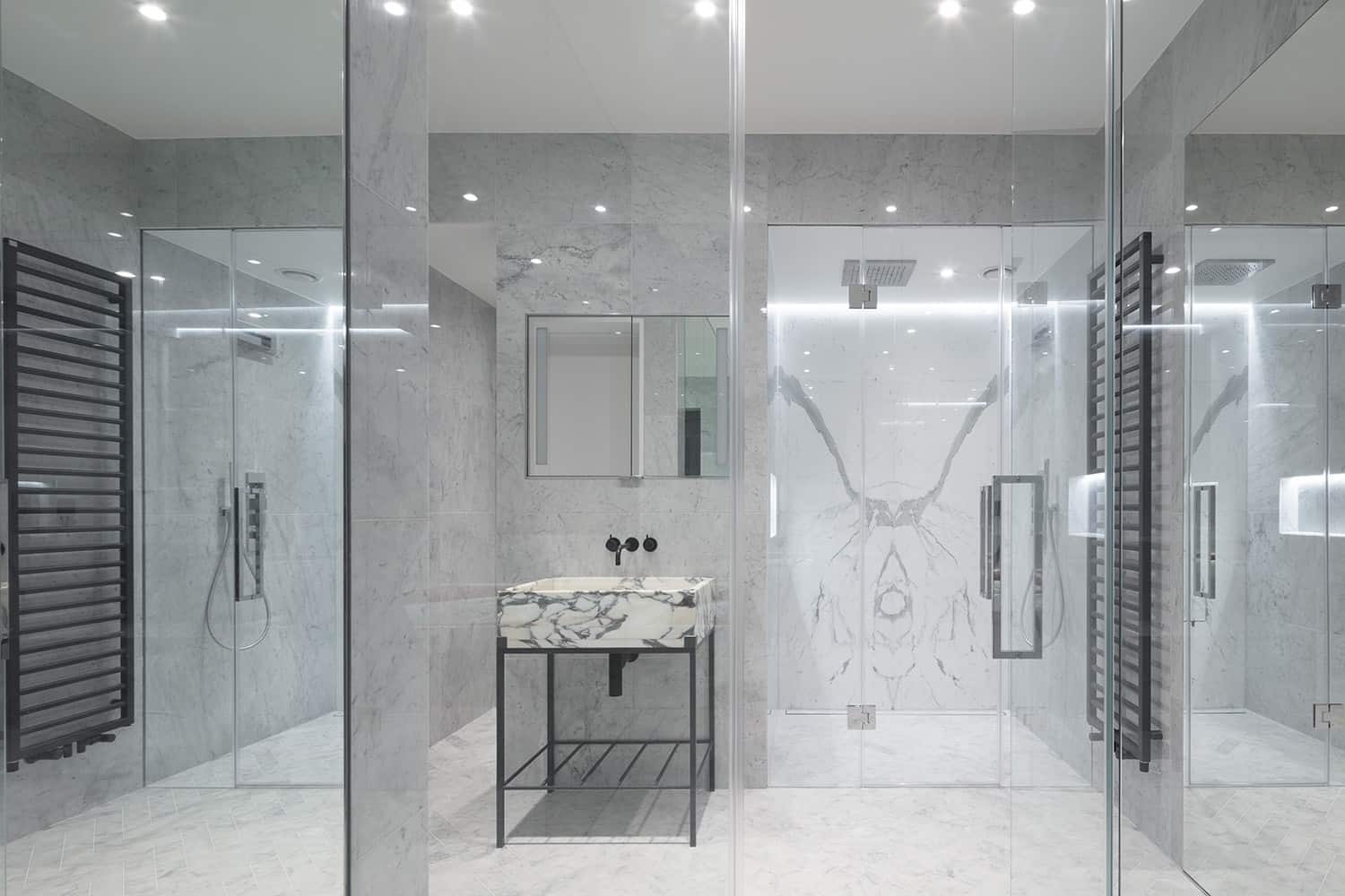
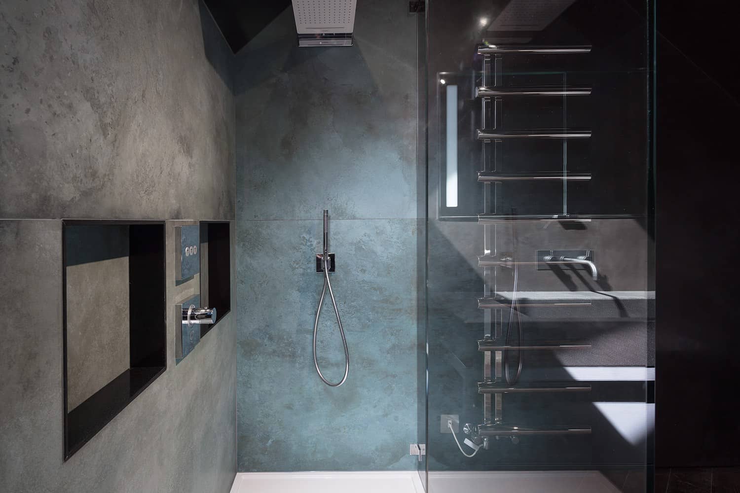
Starting in the basement, we built a guest bedroom, a music room and a spa featuring a steam room, power shower and Bikram yoga wall. The star of the show is a stained Mirano glass panel above the spa that lights up from behind to create the illusion of a window.

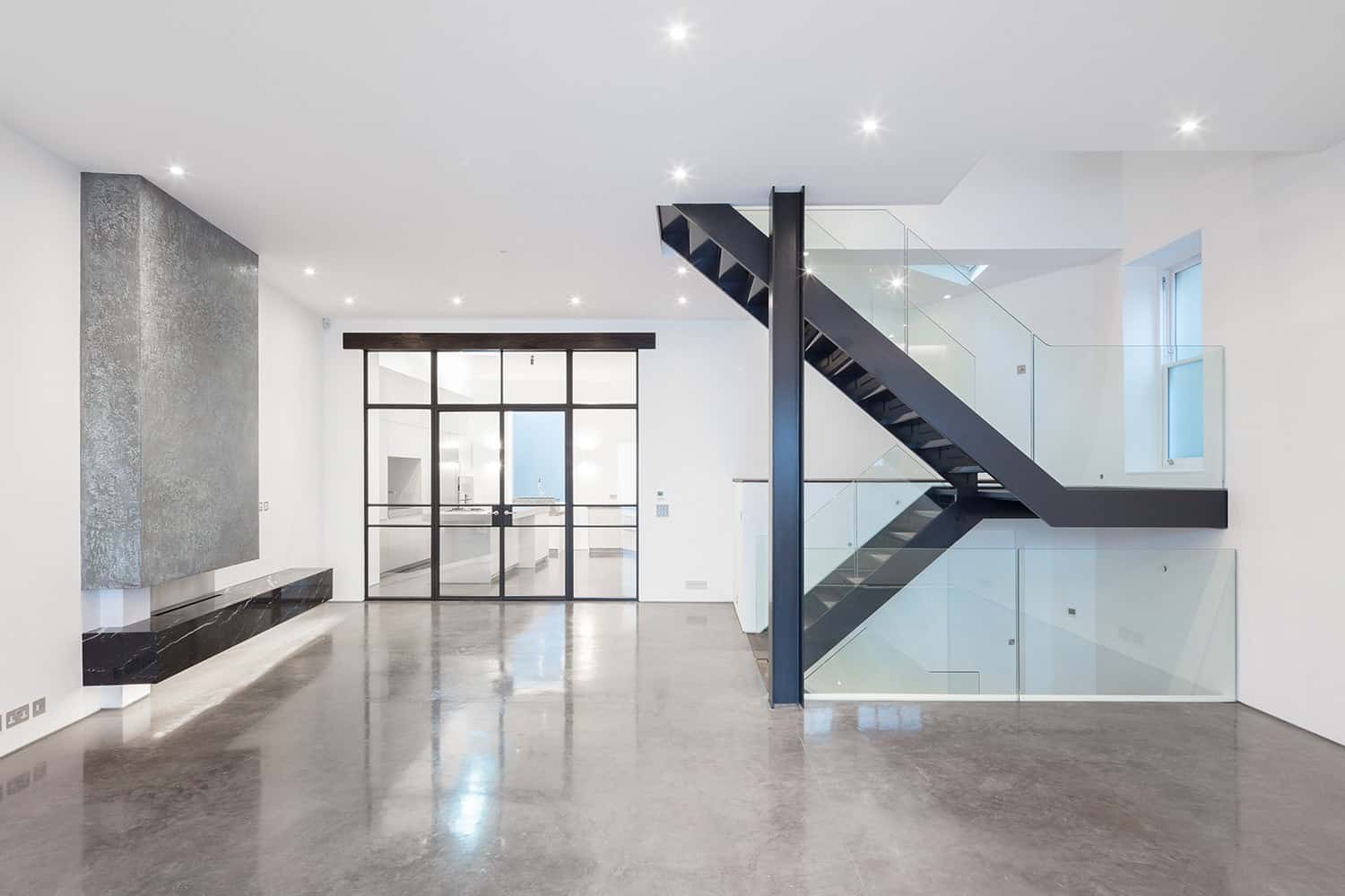
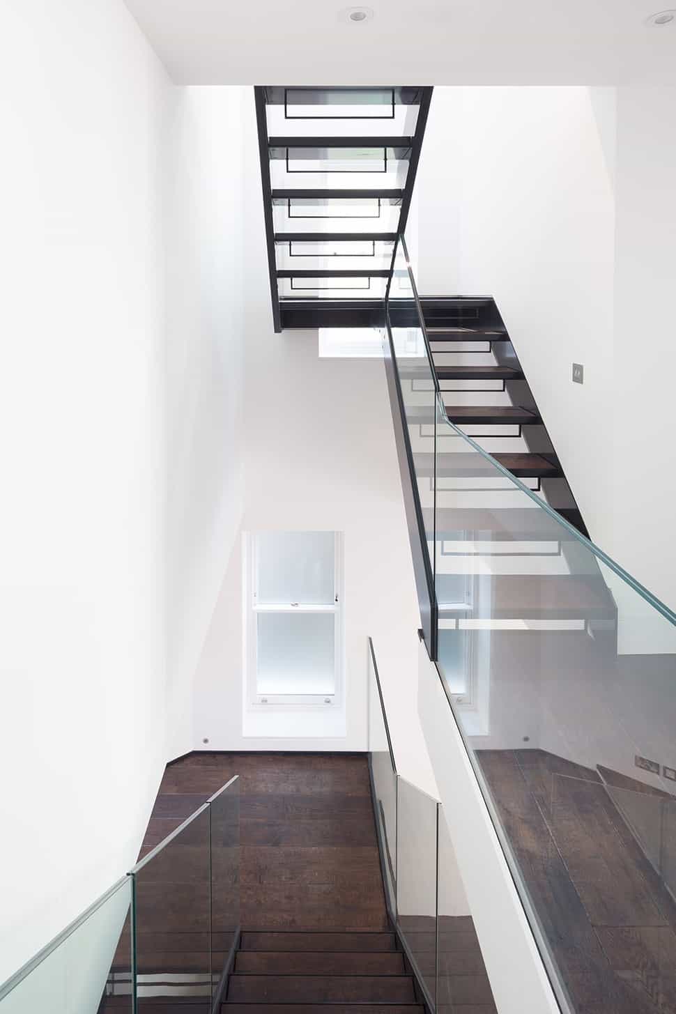
Walk up the bespoke timber staircase with its water-cut glass balustrade and you enter the open plan living and kitchen space, dominated by a bespoke gas fireplace featuring a Nero Marquina marble plinth and a polished plaster chimney breast with a pattern inspired by a volcanic eruption in Norway.

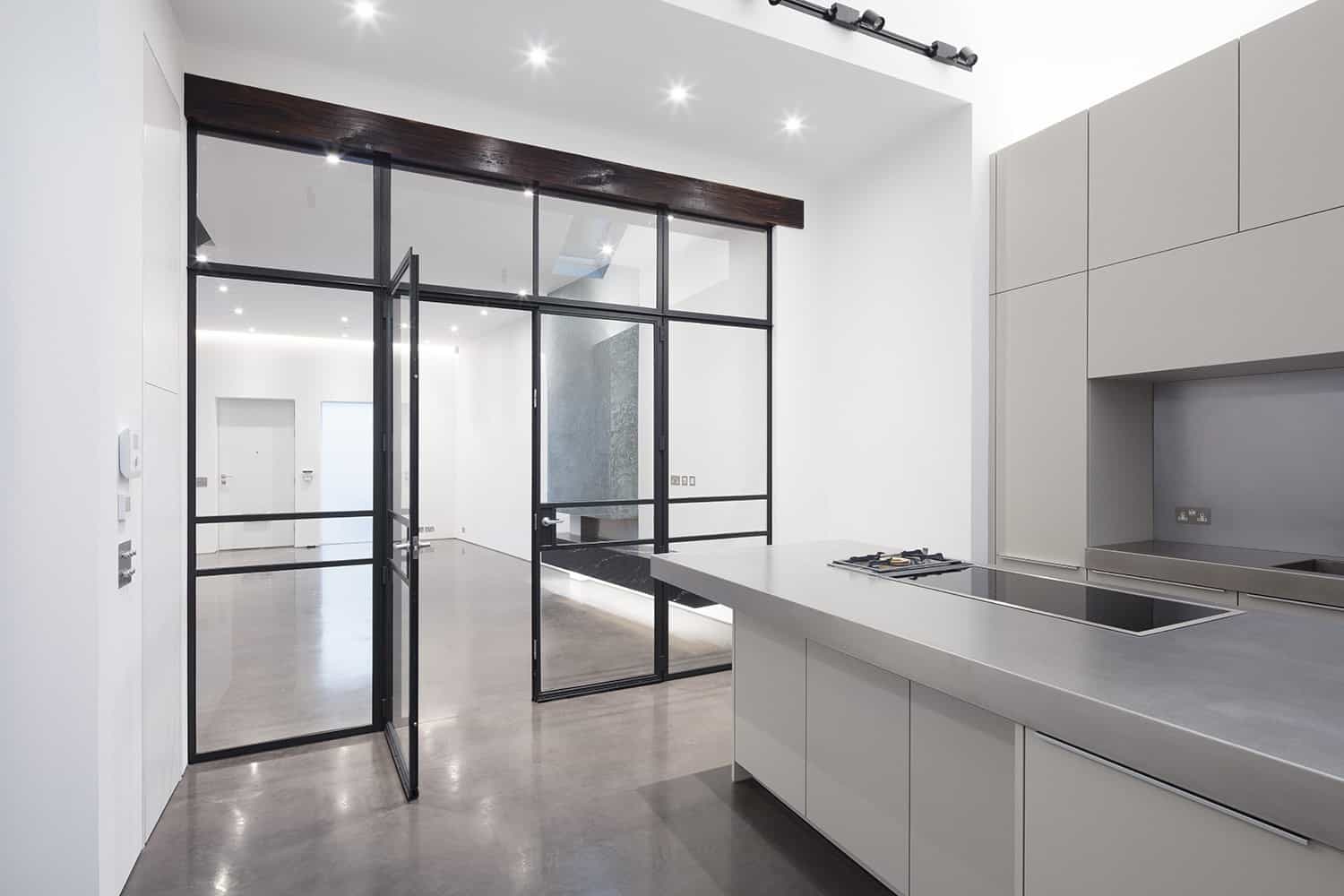
The kitchen area is washed with light from a rear opaque window, roof lights, gallery-style adjustable track lights and a single spotlight whose sole purpose is to illuminate and reveal the texture of the sink sculpted from a solid block of American granite.

As our clients love to cook (and insisted on both induction and gas on their stainless steel kitchen island) we separated the kitchen and living portions of the open plan space with sliding Crittal doors that wouldn’t obstruct the view or the light but would prevent unwanted smells filling the entire house.

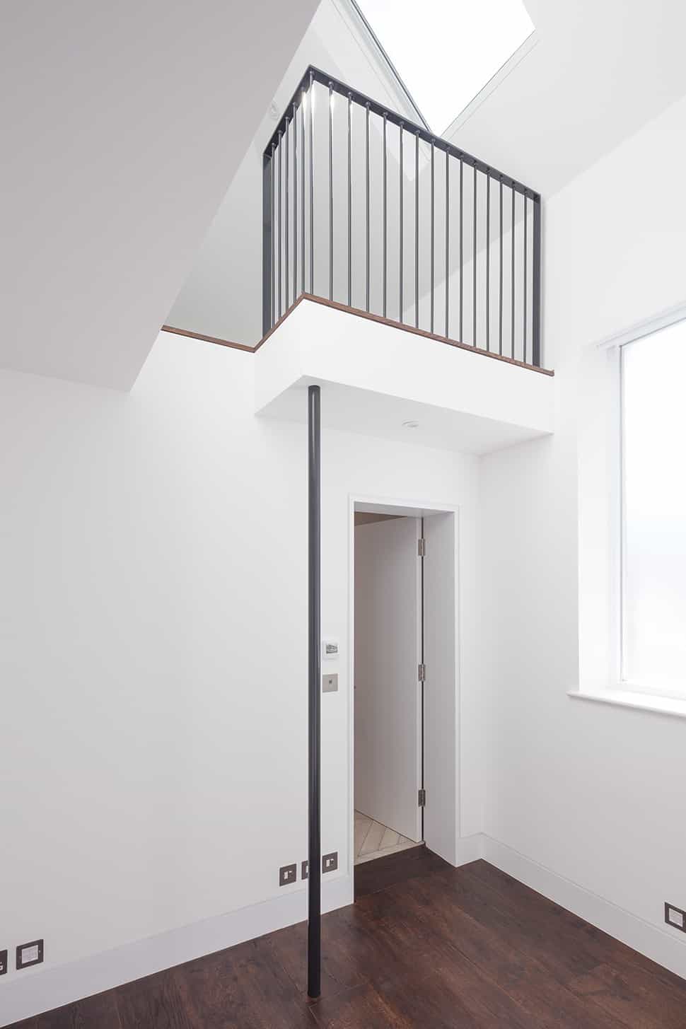
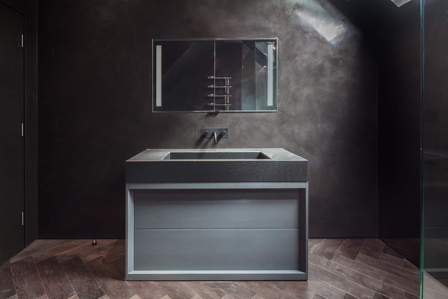
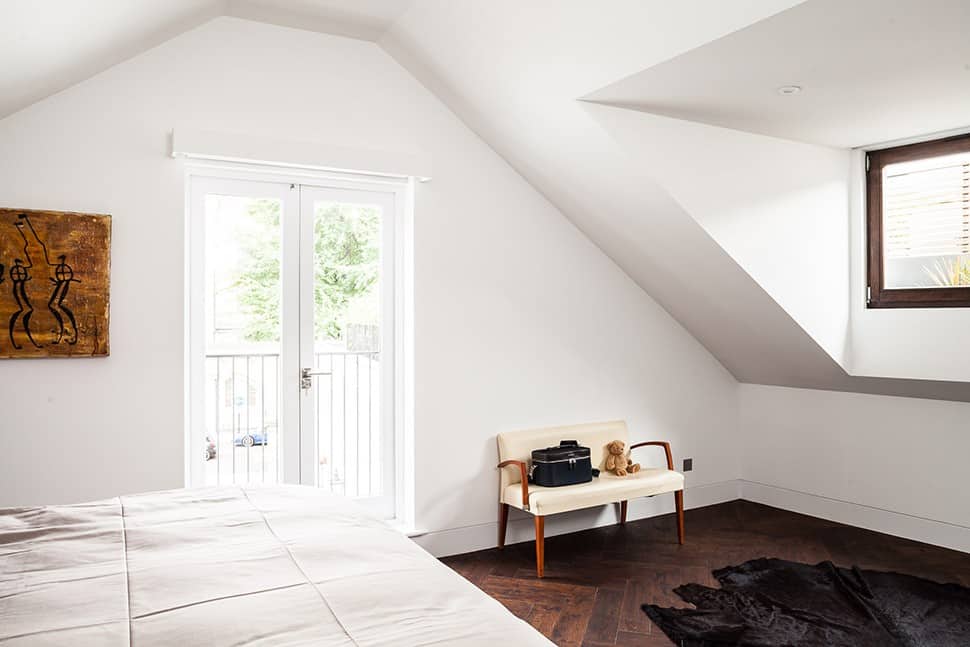
On the first floor are the three children’s bedrooms – one of which features a split-level layout with a mezzanine – while the master suite takes up the entire top floor with a balcony overlooking the mews and a dark, cave-inspired master bathroom with a black, polished plaster sink with rose gold accents which glimmer like fire when they catch the light.
image
image
image
Laverton Mews, London. August 2017. Architect: Dyer Grimes. Contractor: Galower Build.
image
image
image
image