BLOG
INTERESTING STUFF
THAT CAUGHT OUR EYE
From Eyesore to Feast for the Eyes – Earl’s Court Mews Before and After
We recently received a new batch of photography for Earl’s Court Mews, which has truly come to life now that our clients have fully moved in. It’s the perfect opportunity to compare the beauty and elegance of this home now to how it looked when we first set eyes on it.
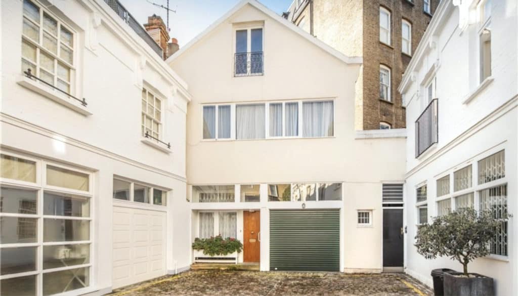
At the end of an otherwise beautiful Victorian mews in Earl’s Court was this eyesore. The mess of a façade was built in 1960s when the building – used as a garage – was converted for residential use with no effort to match to the surroundings.
On the far right is a small door that provides access to the flats behind. These flats significantly complicated the design as many of the rear windows had been blocked off for privacy and couldn’t be reinstated. Natural light proved to be our major design challenge.
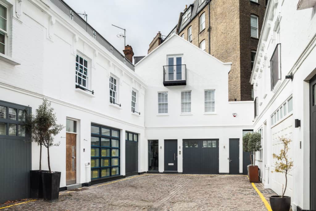
Though the silhouette is the same, the entire front of the house was rebuilt with materials and features that match the surrounding Victorian architecture, which we then decorated with an appropriate colour scheme. Gone are the PVC windows on the first floor, replaced with three authentic timber sash windows.
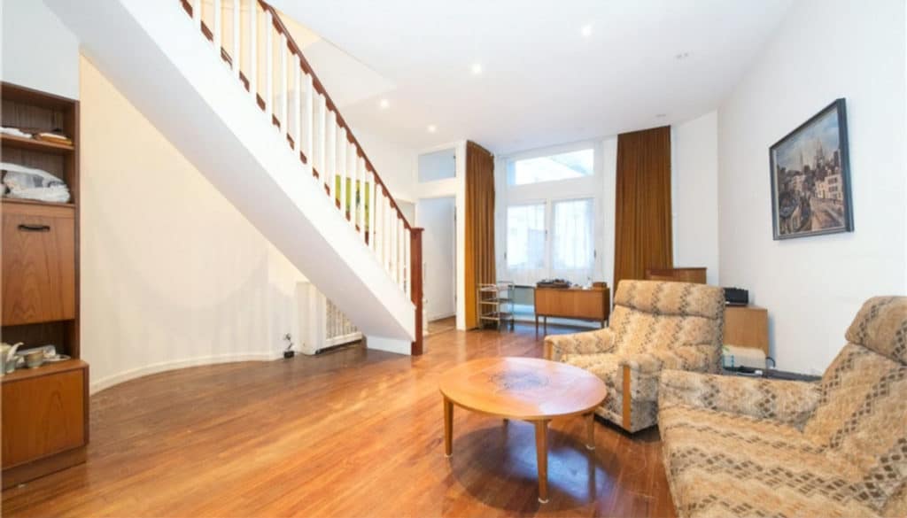
When you walked through the front door of the old house you were greeted by this overwhelmingly brown living room which was – despite what the estate agent’s wide angle lens might lead you to believe – very cramped.
Much of the space was taken up by the awkwardly placed staircase, and very limited light through the front windows meant that the room was deprived of natural light through most of the day.
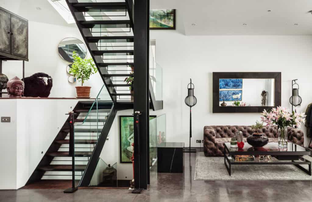
By replacing the stairs with a centred stairwell and rearranging the internal layout, we were able to create a vast, open plan space, transforming the ground floor from cramped and dark to bright and spacious, with windows placed wherever we were able so that natural light can flood in from all angles.
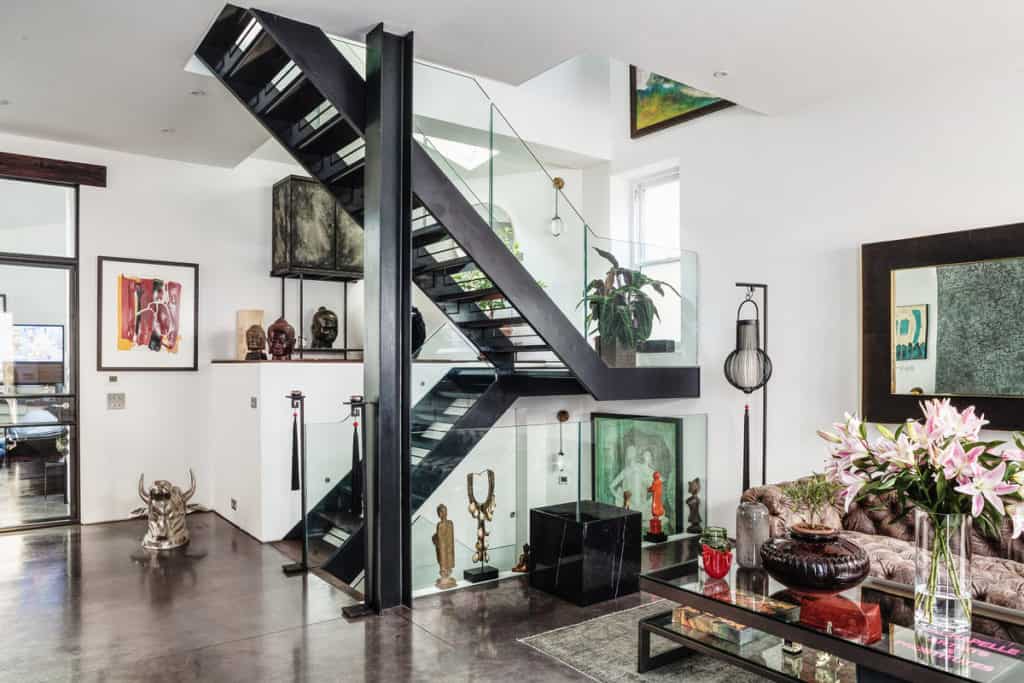
Much of this light is provided by the feature stairwell, which zig-zags all the way from the new basement floor to the converted attic, with a roof light at the top and a window on each landing.
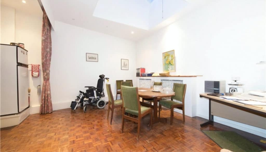
The old kitchen and dining room suffered the same symptoms as the rest of the house: cramped dimensions and a lack of natural light. On the left of the photo, you can see the curtain which was installed to hide the appliances when not in use – a design decision we have thankfully never seen since.
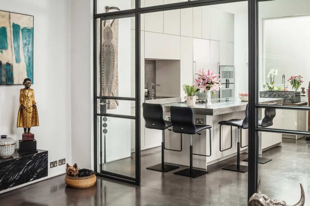
We removed the utility room which once separated the kitchen and living room and installed a Crittal glazed screen to contain smells and sounds while allowing light to travel from the front to the back of the house, an effect enhanced by light bouncing off the polished concrete floors.
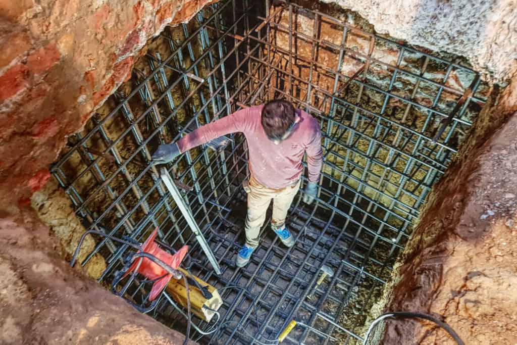
There is no before photo for the basement, because there was no basement before! Instead, here’s a photo from when we started excavating, with the first steel cage installed to support the structure. Our excavation filled the entire plan of the house, providing an enormous increase in floor area.
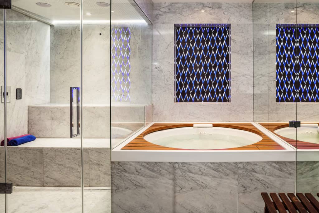
The basement provided many space-saving benefits for the floors above, such as being able to hide away utility and plant rooms, but the star of the show is definitely the spa with a jacuzzi, shower and steam room, all clad in book matched marble.
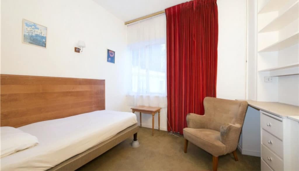
Up on the first floor were three bedrooms and two bathrooms, a feature we maintained in the new design. The floor plan was not radically different other than shuffling around walls to accommodate the new stairwell. Enlarging the rooms would require clever design rather than square footage.
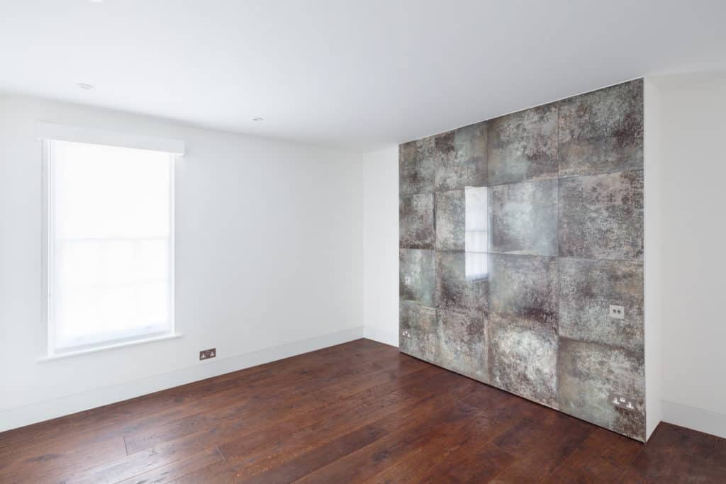
The same bedroom after development (unfortunately unfurnished in this photo) demonstrates the importance of materials in making a room feel more spacious. In place of light-absorbing carpet is a timber floor with an oiled finish, and reflective marble turns storage space into a feature wall.
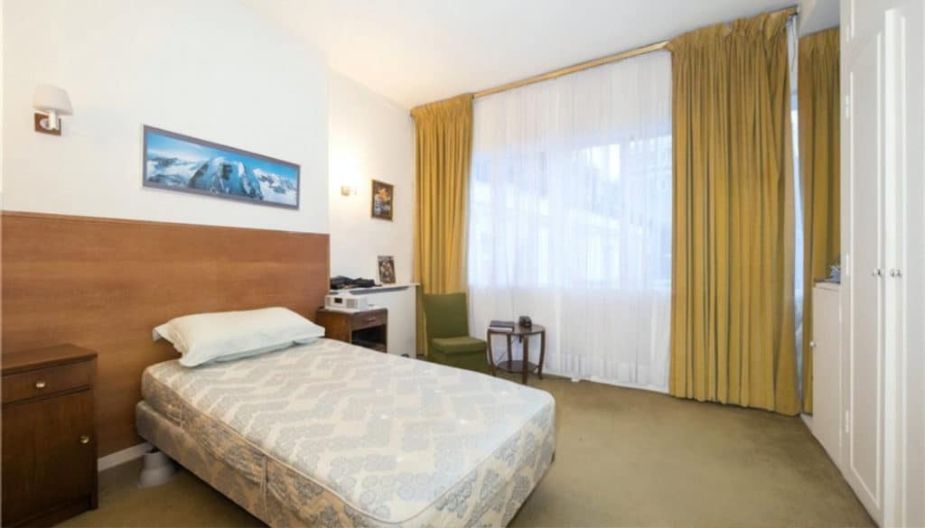
This was the master bedroom, which had en-suite and windows overlooking the mews, now replaced by two sash windows. Despite having the most light of any room in the house, interior design choices still left it feeling small and dark.
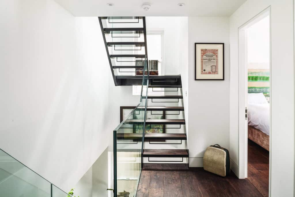
We can only glimpse the new bedroom through the door, but this does give us the opportunity to show more of the stairwell, with its open treads and glass balustrades to maximise light penetration.
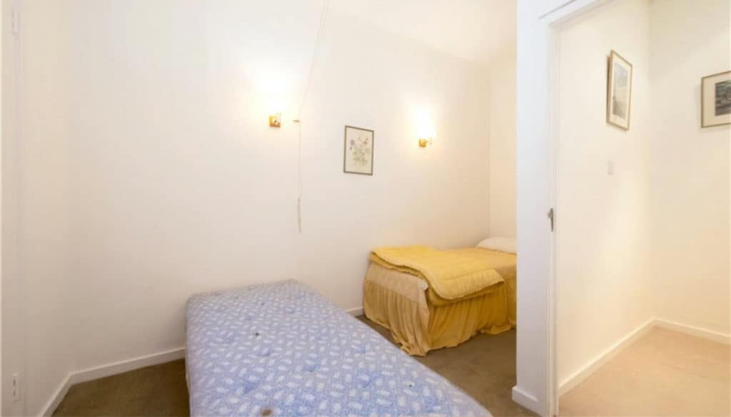
This spare bedroom fared the worst of all the rooms, with no windows other than a single roof light far above and an odd, L-shaped design which resulted from the highly inefficient floor plan.
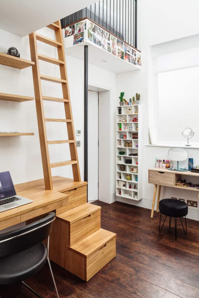
Today, this room is one of the most exciting in the house. We removed the ceiling to create a double height space into the roof, then built a mezzanine bed deck to make the most of the new ceiling height and save space. A new window and expanded roof light provide plenty of natural light.
Through a more sensible floor plan, we even found space to install an en-suite bathroom below the bed deck, entered through the door you see above.
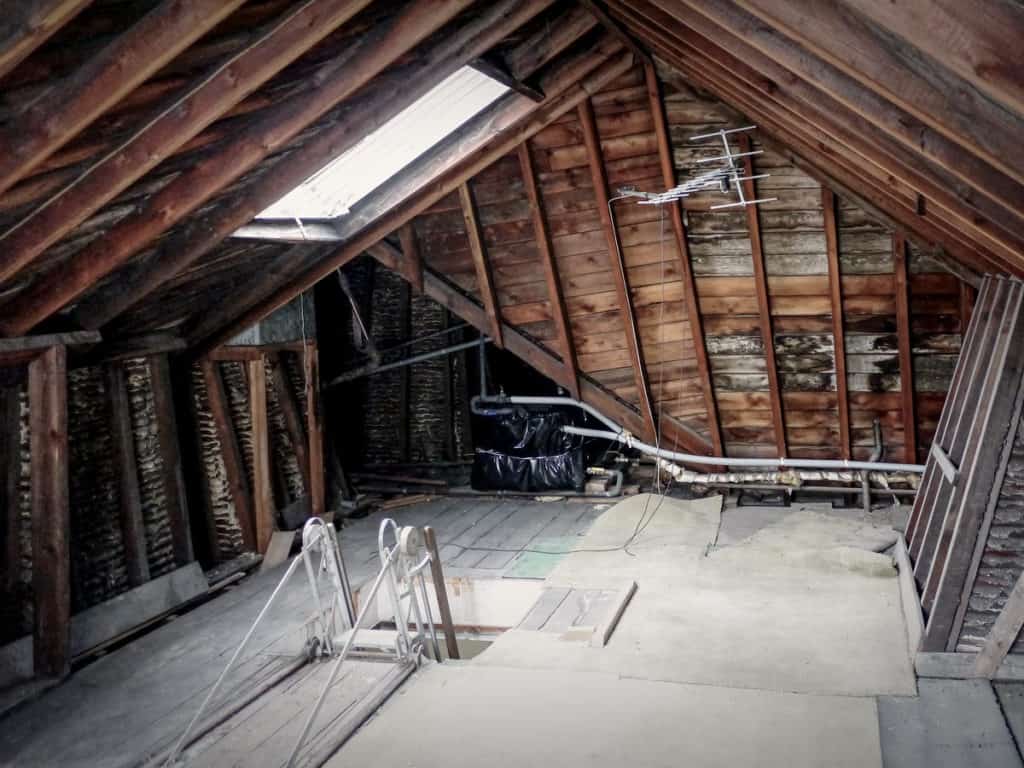
There’s little to show of the old loft as it was only used for storage, which made the roof light in this photo an absolute waste. There was even a double door opening to a Juliet balcony, visible in the photos of the exterior. We suspect that a loft conversion had been started but abandoned.
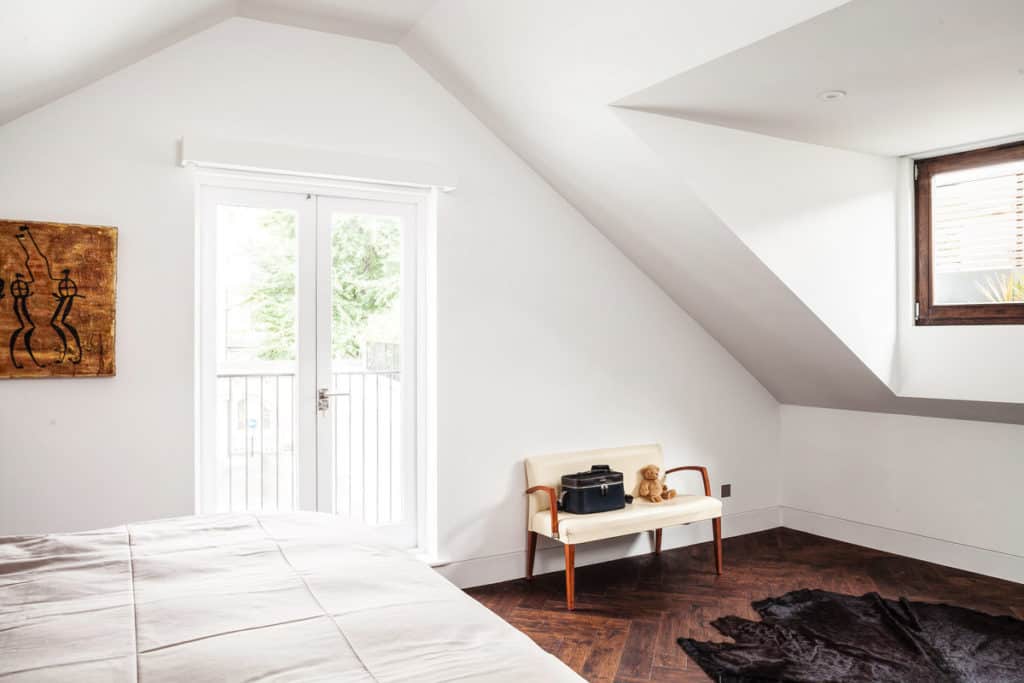
And here is perhaps the most dramatic transformation of the project. We converted the roof space to the master bedroom, finally making use of floor’s potential – and that Juliet balcony. The roof, though superficially similar, was fully rebuilt.
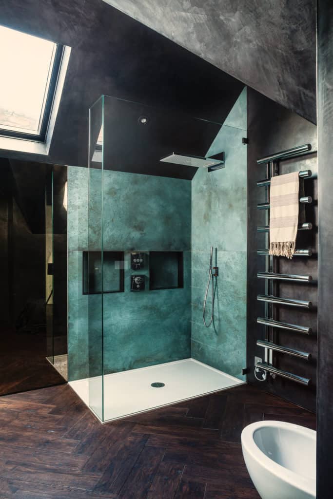
A master bedroom wouldn’t be complete without an en-suite, and this may be one of our finest yet. The client requested the atmosphere of a cave, achieved through polished black plaster with flecks of reflective gold and aqua ceramic tiles that glimmer like a subterranean pool.
We hope you enjoyed this before and after look at Earl’s Court Mews. If you would like to see more from this project, click here for Michael’s photo tour from when the project was first completed.
